Statement of Intent by Jamie Reeder on Scribd
Thursday, February 3, 2022
Tuesday, November 9, 2021


Tuesday, October 12, 2021
Pre-production work
A Synopsis of my idea
- My magazine is full of real life stories, sport and competitions to win technology prizes as it attracts the demographic of 16-25 year olds.
- The magazine is for the readers so they tell us what they are interested in, this allows us to respond with stories that they like which brings the brand and the readers closer.
- We aim to have a strong reader loyalty in order to keep replenishing interesting stories towards our consistent readers.
What representations am I going to construct?
- I aim construct representations of people of the ages 16 years old to 24 year olds
- I also aim to construct representations of working class and upper class people
- I am aiming to appeal to a target audience of 16 to 25 years olds 9as the brief says) as they will want to know the latest news on topics they will be interested in, for example: sport stories and stories linking to their social group.
How am I going to appeal to a target audience?
- I am going to appeal to my target audience (as the brief says 16-25 years old) by getting feedback from them in order to construct and create stories that would be interesting for them to read, this gains an aspect of customer feedback.
- Another way I am going to appeal to my target audience is by offering chances to win prizes, for example new technology, in order to entice them into interacting with the media product.
- Another way I am going to appeal to my target audience is by showing stories that they would be interested in.
Initial name of my magazine, why have I chosen it?
- I have chosen the name 'Vision' because I feel as if it gives the readers/consumers a clear and detailed view of stories and articles that they will be attracted to and will read.
Masthead Designs
- I have chosen three different styles of typography for my masthead/logo because I feel as if they represent the image and brand name I am trying to put across.


Flat plan or mock designs of the first two editions
- So far I have roughly put together the edition 1 front cover. A you can see, I am aiming to create a vibrant masthead in order to stand out for the rest of the page.
- The red and yellow colours work really well against each other to allow them to stand out. I aim to have 3/4 stories/articles in order to give the consumer an overall picture in what the magazine ' Vision' is about.
- These boxes down the side of the page will have images to do with new, hot off of the press stories that appeal to the demographic (as the brief says age 16-25 years old).
- Then, in smaller boxes next to the images relating to the articles, their will be a brief summary of the story happening within that image to give the reader an insight or a teaser in order to get them to buy the magazine and red on.
- This first edition of the magazine will appeal to more of a middle class audience aged 16-25.

- The second edition of the magazine will almost have the same layout and design.
- However, the articles will be different as in this edition is to appeal to working class people of ages 16-25.
- So this will include, different stories, different images etc.
Articles
- Some ideas of articles that I want to produce within the magazine are: Sports and Real-life stories (obviously they'll all in some way relate to the specific representations I am trying to represent within the cover lines and images)
- I am going to have 2-4 images on the front cover including one main image which will represent the main story which will show at least one representations
- I will have a short teasing cover line as the rest of the articles/stories will be within the magazine making the reader buy the magazine and read on.
Photoshoot plans
- I am planning to have two photoshoots for two different magazine front covers.
- One photoshoot will be of a women dressed in working class clothing in a 'working class' background to emphasise the representations I am trying to show.
- Whereas the second photoshoot will be on a male dressed in middle class clothing in a wealthy area in the background again to emphasise the representations I am trying to show.
Experiment with photoshoot and design layouts
Participant Release


Website Mock Up
Website Contents Mock Up
Tuesday, September 7, 2021
Website analysis research
Take A Break
- On the right hand side of the website it offers 'exclusive' offers to save money on your next holiday. This influences the consumer to get involved with winning the competition and also engages the consumers more with the brand.
- They also advertise other versions of their magazines from the past weeks or months to encourage the consumer to buy and read them.
- They also push other stories across that they're target audience may be interested in order to hook them in.
- They target their audience by suggesting other stories or advice on general life queries suggesting their demographic.
- The layout of this website pushes the main stories and newest content right at the attention of the consumer so they miss it suggesting that they want to update their consumers as soon as possible so they look further into other articles etc.
- The images used within the website show happy and joyful women with a bright background surrounded by stories left, right and centre suggesting the target audience that they are pushing this towards in order to show their brand identity towards the consumer.
- This has been constructed for the maximum appeal by using articles that would draw the attention of the consumer suggesting more interaction. The use of the bright colours and the layout also makes the story hit harder towards the consumers eye contrasting with the background.
- They have links to all social media which attracts more consumer interaction.
- The navigation tools at the top of the page are in bright white text corresponding with a pinky red background in order to stand out against the rest of the page. Their are multiple linked pages which lead to all different types of ways the consumer can interact with the website such as giveaway competitions puzzles etc.

Contents
- They advertise other magazines that have been published by them to influence the consumer to either read, look or purchase another copy. This allows Take A Break to keep customers drawn in with the latest gossip and newest stories they maybe be interested in.
- They produce articles about personal life stories published by themselves in order to grow the connection between the consumer and the magazine which gain influences the consumer to keep buying the magazine.
- Their linked pages such as bingo and puzzles again suggest their type of demographic and the audience they're publishing this towards.


Heat
- They show up to date TV reality show drama (e.g. Love Island) which suggest the type of audience and demographic they are aiming this magazine towards.
- They have big celebrity or famous faces ( E.g. Sarah Harding and Millie Grace Court from Love Island) that their consumers would recognise and click on in order to find more information about as they may be interested in. This allows Heat to get more interaction with their consumers which could transition into more sales and subscriptions etc.
- Heat are very big on advertising clothing, this is shown by the the connection they have with Love Island as the contestants where branded clothing which ties into the mass amounts of advertising and articles of the show.
- Their advertisements and articles also suggest a certain demographic that their aiming their products towards.
- The layout of this website pushes the main stories and newest content right at the attention of the consumer so they miss it suggesting that they want to update their consumers as soon as possible so they look further into other articles etc.
- They have links to all social media which attracts more consumer interaction.
- This has been constructed for the maximum appeal by using articles that would draw the attention of the consumer suggesting more interaction. The use of the bright colours and the layout also makes the story hit harder towards the consumers eye contrasting with the background.
- The navigation tools at the top of the page are in bright white text corresponding with a bold red background in order to stand out against the rest of the page. Their are multiple linked pages which lead to all different types of ways the consumer can interact with the website such as giveaway competitions etc.
- The images used within the website show happy and joyful women with a bright background in order to make them stand out, this suggests the target audience that they are pushing this towards in order to show their brand identity towards the consumer.

Contents
- They aim their certain main articles which consist of Love Island gossip, celebrity social life like Katie Price and many more. Again this also shows the demographic they're trying to base their articles and stories about.
- Their linked pages consist of fashion, beauty and reality stories which act as a more detailed version about all of the real life stories. This gives the consumers more of a chance to gather more information instead of one main story.
- They don't have many ways of interacting with heir consumers but they do have an 'win' page which has chances to win tickets, equipment holidays etc.


Sports Illustrated
- The main, newest headlines are linked on the right hand side so if the consumer wants to look more into that story they can.
- The main stories consist of an image in order to give the consumer more idea of the story.
- Again this has been constructed for the maximum appeal by using articles that would draw the attention of the consumer suggesting more interaction. The use of the bright white on the back of a dark red heading suggests that the layout also makes the story hit harder towards the consumers eye contrasting with the background. However the white background pushes the rest of the stories towards the consumer.
- The linked pages are all detailed articles of different sports suggesting they don't just primarily cover one sports news.

Contents
- This is just one of the linked pages leading to more in-depth news on NFL games, players etc.

Sunday, July 4, 2021
Magazine analysis research
Two magazines about real life stories
![]() Take A
Break Magazine
Take A
Break Magazine
- The masthead of the magazine uses white text on a read background with these two colours complementing each other. The colours typically draw in a female audience rather than a male audience.
- The main front cover image uses direct address from the female’s eyes as it looks as if the female is looking directly at the consumer. The layout shows that all the stories are fitted around this women’s face to suggest that she is the centre image and attracting the potential buyer
- These other stories on the left-hand side of the magazine could also be relatable to the audience which could entice them to buy the magazine.
-
- The main front cover image uses direct address from the female’s eyes as it looks as if the female is looking directly at the consumer. The layout shows that all the stories are fitted around this women’s face to suggest that she is the centre image and attracting the potential buyer.
- The
lighting shone on the females face as if to suggests the power she upholds.

Contents
Within the contents page the big and bold writing stands out and contrasts against the background. This gives the reader another story that might appeal to them.
They have big questions that are talked about every day by the media to welcome and allow the reader of the magazine to voice their opinion. This suggests the connection that the magazine is trying to build with the consumer.
They also include little sections written by 'professional' voicing their opinion to allow the consumer to see all sides of the story.

Heat Magazine
The use of clothing and influencers suggests the audience demographic that they’re are aiming their product towards.
- The use of famous celebrities within the front cover of the magazine (for example: Gemma Collins and Katie Price suggests the type of audience that they’re trying t interact with. These famous faces connect with the consumer and draws them in to buy the magazine and reads more about what is the latest gossip around them.
- The advert suggests their audience demographic as it appeals toward women. The small message in italic white writing n the pink background reads ‘for every body’ suggesting the intertextuality of not just the product diversity that they are advertising, but the magazine diversity shows the range of women that they are directing this to.
- The layout of the magazine is quite hectic and not orderly set out as different stories are covering certain parts of other stories. This suggests intersexuality that the stories that they are reporting on are hectic, busy and are almost like breaking news as such.
- The use of colour palette of big and bold white letting on this magazine suggests the main story that they are pushing across towards the readers.

Contents
- The use of famous celebrities on the contents page such as Justin Bieber and Mylie Cyrus suggests the type of audience that they are trying t interact with. They use certain types of photos to correspond with the story that the are writing to suggest the celebrities’ emotions and feelings on the matter.
The use of the main strapline in the content space in big and bold white and yellow writing stands out on a partial image in the background as it gives the reader an insight on what the text below will be about.

One magazine from any genre
The phrase ‘the king’s gambit’ suggests the intertextuality
with the queen gambit (which was a highly talked about show at the time of
making this magazine). This suggests that LeBron James (the athlete picoted
here) is the controller and starts with the opening moves.
The use of a famous athlete/ celebrity of LeBron James
suggests the audience demographic and to draw readers and consumers in.
The use of the bold purple masthead stands out on a bright
orange background suggesting its purpose to catch the reader attention.
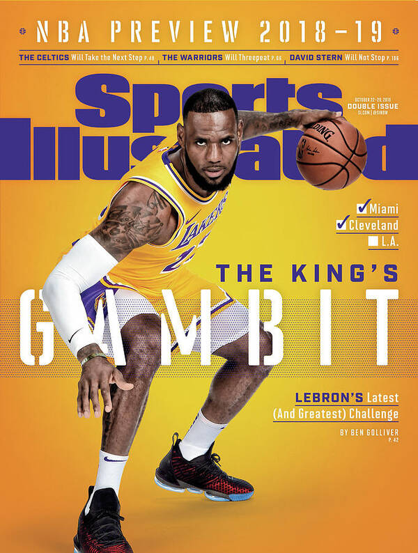
The
contents page consists of chapters or sections where you can read about other
stories within the sporting world. These images below give the reader a rough
outline of what could be involved within the newspaper

Thursday, July 1, 2021
Audience research
·
Who is my typical reader?
As this graph shows, people who already read real-life story
magazines are predominantly around thew ages of 16-25 and are female. This
suggests that they are the target demographic that want to keep up with all of the
daily news and latest gossip on celebrities. In a real-life magazine, readers
look for latest updates on their favourite celebrities lives and topics that they
can chat to their friends about. Tis content produced by real-life magazines allows
them t engage with eth audience. This then allows them to produce offers and abilities
to win money or trips somewhere which allows them to further engage with their audience
demographic.
Produce an audience/reader profile
Gender – Predominantly Female
Age – 16-25
Education – College/Uni Student
Occupation – Any
Nationality – Predominantly British
In their spare time my target audience enjoys socialising
with friends about the new hot topics going on around the world. This involves both
national news and celebrity news. As they still may be in education, they will most
likely have little money and therefore like to know what fame and celebrity
life is like with their favourite celebrity personalities and what they do on
their day-to-day livelihood. They like to chat about the latest fashion wear,
new events coming up etc due to the popularisation and advertisement of these in
the media.
Research into the industry, form and genre
Research into the industry, form, and genre
Industry
Who are Bauer?
Bauer Media Group are a German multimedia conglomerate
headquartered in Hamburg. It operates worldwide and owns more than 600
magazines, over 400 digital products and 50 radio and TV stations They also
have print shops, postal, distribution and marketing services. Bauer has a
workforce of approximately 11,000 in 17 countries suggesting that they are a
conglomerate. Bauer own lots of big names within media, some magazines that they
own are Heat, TV Choice and Grazia. They also own radio stations Kiss and Magic
and a television venture with Channel 4, this ranks then as one of the most low-profile
media owners in Britain.
Form
What is the purpose of cross-media production in magazines?
Cross-Media is something that includes the distribution of
content (for examples music, text, pictures, video etc). One often used
combination is magazines, mobile devices, and Internet. Magazines in particular
uses cross-media production to spread their product out in different ways in order
to attract an audience. Big magazine brand like Teen Vogue have websites to
promotes and share stories on there as well as real copies. This is to give the
brand identity more of an open pathway into exploring different was that
cross-media production and synergy, which is the promotion and sale of a
product (and all its versions throughout the various subsidiaries of a media
conglomerate, can help their brand push their product forward using modern-day technology.
Genre
What is a real-life magazine?
A Real-Life story magazine is a story that is a description
of imaginary people and events, which is written or told in a story format in order
to engage with the reader. Examples of real-life stories that magazines like Bauer
have are such as: weight loss, hacks and life skills etc. This allows these types
of real-life story magazines to engage with their audience demographic and essentially
tell them a story that they would be interested in. This allows the magazine to
attract and gain a new audience to sell their products to.
Subscribe to:
Posts (Atom)
-
Statement of Intent by Jamie Reeder on Scribd
-
· General Research How are technical and visual codes used to construct meaning within magazines? Magazines have a number of key con...
