Two magazines about real life stories
![]() Take A
Break Magazine
Take A
Break Magazine
- The masthead of the magazine uses white text on a read background with these two colours complementing each other. The colours typically draw in a female audience rather than a male audience.
- The main front cover image uses direct address from the female’s eyes as it looks as if the female is looking directly at the consumer. The layout shows that all the stories are fitted around this women’s face to suggest that she is the centre image and attracting the potential buyer
- These other stories on the left-hand side of the magazine could also be relatable to the audience which could entice them to buy the magazine.
-
- The main front cover image uses direct address from the female’s eyes as it looks as if the female is looking directly at the consumer. The layout shows that all the stories are fitted around this women’s face to suggest that she is the centre image and attracting the potential buyer.
- The
lighting shone on the females face as if to suggests the power she upholds.

Within the contents page the big and bold writing stands out and contrasts against the background. This gives the reader another story that might appeal to them.
They have big questions that are talked about every day by the media to welcome and allow the reader of the magazine to voice their opinion. This suggests the connection that the magazine is trying to build with the consumer.
They also include little sections written by 'professional' voicing their opinion to allow the consumer to see all sides of the story.

Heat Magazine
The use of clothing and influencers suggests the audience demographic that they’re are aiming their product towards.
- The use of famous celebrities within the front cover of the magazine (for example: Gemma Collins and Katie Price suggests the type of audience that they’re trying t interact with. These famous faces connect with the consumer and draws them in to buy the magazine and reads more about what is the latest gossip around them.
- The advert suggests their audience demographic as it appeals toward women. The small message in italic white writing n the pink background reads ‘for every body’ suggesting the intertextuality of not just the product diversity that they are advertising, but the magazine diversity shows the range of women that they are directing this to.
- The layout of the magazine is quite hectic and not orderly set out as different stories are covering certain parts of other stories. This suggests intersexuality that the stories that they are reporting on are hectic, busy and are almost like breaking news as such.
- The use of colour palette of big and bold white letting on this magazine suggests the main story that they are pushing across towards the readers.

- The use of famous celebrities on the contents page such as Justin Bieber and Mylie Cyrus suggests the type of audience that they are trying t interact with. They use certain types of photos to correspond with the story that the are writing to suggest the celebrities’ emotions and feelings on the matter.
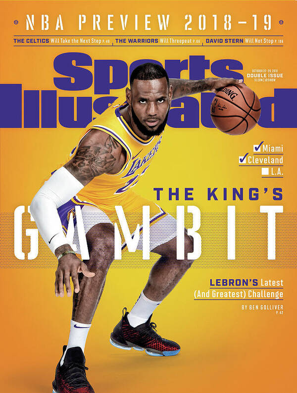
The use of the main strapline in the content space in big and bold white and yellow writing stands out on a partial image in the background as it gives the reader an insight on what the text below will be about.

The phrase ‘the king’s gambit’ suggests the intertextuality
with the queen gambit (which was a highly talked about show at the time of
making this magazine). This suggests that LeBron James (the athlete picoted
here) is the controller and starts with the opening moves.
The use of a famous athlete/ celebrity of LeBron James
suggests the audience demographic and to draw readers and consumers in.
The use of the bold purple masthead stands out on a bright
orange background suggesting its purpose to catch the reader attention.


No comments:
Post a Comment